Collecting email addresses is a crucial first step in nurturing relationships with potential customers, and it forms the cornerstone of any successful email marketing strategy. But the process involves more than just harvesting addresses — it's about creating a compelling and engaging experience that encourages visitors to willingly opt-in to your email list.
Designing an effective email sign-up form can often feel like a challenging task. It involves balancing aesthetically pleasing design with persuasive content and intuitive functionality. Many businesses find it tough to manage, but this guide aims to make the task simpler and more accessible. The insights provided here will help you increase your subscriber base, boost customer engagement, and propel your business to greater heights.

The Role of Email Sign-up Forms in Marketing
Every subscription represents an individual who has shown interest in your brand and wants to hear more from you. This isn't just about amassing numbers, but about engaging with a targeted audience who has a high potential of converting into paying customers.
Beyond this, effective email sign-up forms can provide several benefits.
- Cost-effectiveness. They are a cost-effective way to reach your audience, bypassing the expenses associated with traditional marketing channels.
- Increased engagement. They offer the ability to deliver personalized content directly to your subscribers, enhancing the likelihood of engagement.
- Accessibility. By integrating email sign-up forms into your website or social media platforms, you can reach out to your audience at any time, regardless of their location or time zone.
In essence, these forms not only expand your reach but also strengthen your relationship with potential customers, driving your business growth in the long run.
Key Components of an Effective Email Sign-up Form
The success of your email marketing efforts hinges on the design of your sign-up form. To optimize conversion rates, it's essential to focus on several key components.
Craft a Compelling Call-to-Action (CTA)
The CTA is your hook; it's the persuasive prompt that urges visitors to provide their email addresses. A generic "Subscribe" or “Sign up for our newsletter” button might not incite much excitement, whereas a more personalized, benefit-driven CTA such as "Get exclusive tips and offers" can significantly boost sign-ups.
Build Trust with Transparency and Privacy Measures
Trust is another important factor. With concerns about privacy and data misuse at an all-time high, transparency in your sign-up form is vital. Clearly explain why you're collecting emails and how you plan to use them. Assure visitors that you respect their privacy and will protect their information. This not only establishes trust but also ensures you're complying with data protection regulations.
Optimize the Design for User Experience
The form should be easy to locate, intuitive to use, and quick to complete. Lengthy forms with multiple fields can deter potential subscribers. A 2020 study by HubSpot found that conversion rates could increase by up to 120% when forms were reduced from four fields to three. Most often, a name and an email address are sufficient to get you started.
Add the Relevant Picture
Pictures can add an element of interest to your form and make it more engaging. However, be sure to use relevant images. A picture that doesn't align with your offering can confuse visitors and deter sign-ups. In essence, your visuals should support and enhance your message, not distract from it.
Offer Value-Added Incentives
An exclusive discount, for instance, creates a win-win scenario for both parties. The visitor gets a valuable deal, and your business secures a potential customer. Similarly, providing a free e-book or a helpful guide can attract visitors who are interested in the knowledge you offer.
Access to premium content is another enticing incentive. Studies show that 'gated content', like exclusive articles or webinars, can boost conversion rates by as much as 80%. By making high-quality content exclusive to subscribers, you're giving visitors a compelling reason to join your email list.
Integrate the Form with Your Email Marketing Software
This allows for real-time, seamless data collection as soon as a user submits their information. Without this integration, you would need to manually input each subscriber's information into your email system, which is both time-consuming and error-prone.
By enabling automated responses, you can immediately engage with your new subscribers, which could involve sending a welcome email or a confirmation message. These instant responses not only create a positive first impression but also help in validating the email addresses and ensuring the user's intent to subscribe.
Track and Analyze Performance Metrics
Once the form is live, tracking and analyzing performance metrics is paramount. Pay attention to metrics like the number of views, conversion rate, and bounce rate. This data can provide valuable insights into what's working and what isn't.
Leverage Social Proof to Encourage Sign-ups
Lastly, displaying testimonials, reviews, or subscriber count can boost credibility and reassure visitors that subscribing to your email list is worthwhile. In essence, a well-crafted email sign-up form is a blend of compelling content, intuitive design, and trust-building elements, all backed by data-driven decision-making.

Successful Email Sign-up Form Examples
Drawing inspiration from successful examples can provide useful insights when creating your email sign-up form. Here are a few case studies of businesses that got it right:
Dropbox's Simple but Compelling Sign-up Form

Dropbox, a leading cloud storage service, employs a simple and direct approach for their sign-up form. It includes only one field — an email, streamlining the process. Their headline, "Get the latest news and views from Dropbox delivered to your inbox", instantly communicates the value proposition, making it hard for visitors to resist.
Hydrant’s Incentive-Driven Sign-up Form

Hydrant, a hydration company, entices new subscribers by offering a tangible incentive. Their headline promises a 5% discount on the next purchase for new email subscribers. This creates an instant value proposition for visitors. The form itself is short and visually appealing, keeping the user's attention on the offer.
Ace&Tate’s Trust-Building Sign-up Form
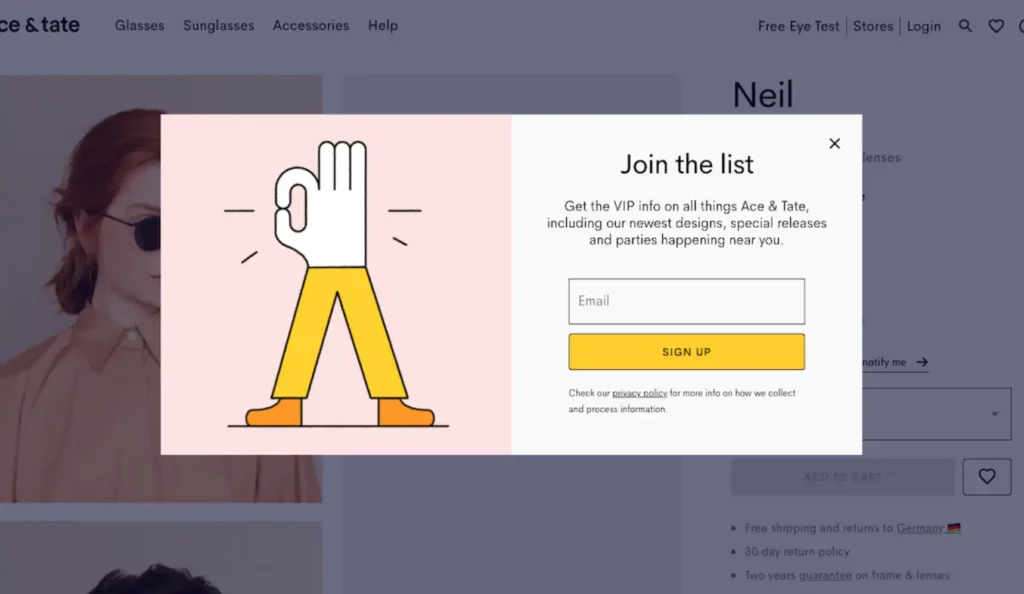
Ace&Tate, a glasses brand, emphasizes transparency and trust-building in their sign-up form. They explicitly state the benefits of subscribing, namely, access to VIP info, fresh designs and special releases. Furthermore, they include the privacy policy link to keep users informed about the information collecting process.
The HUSTLE's Social Proof-Backed Sign-up Form
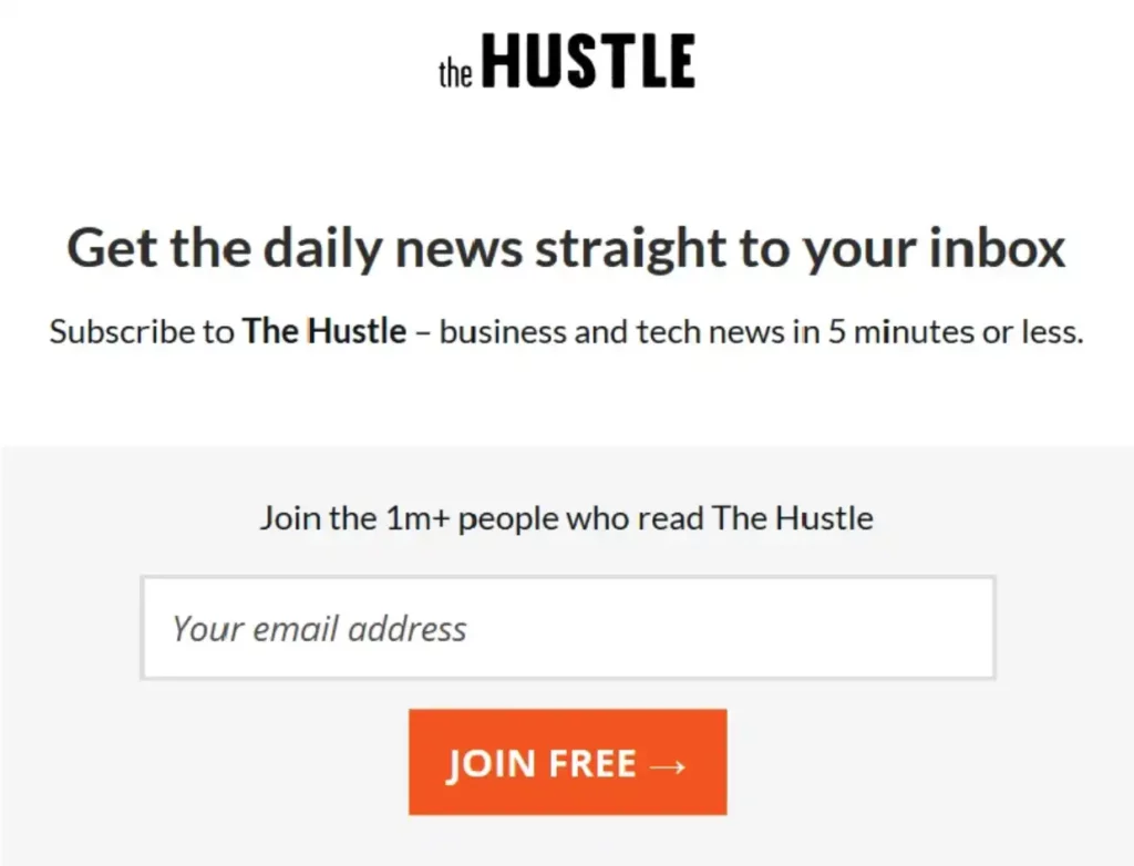
The HUSTLE, a popular online news website, uses social proof to encourage sign-ups. Their form highlights the fact that over 1 million students have joined their community, reinforcing the value and credibility of their platform. They also offer joining for free, adding an extra incentive.
By Regina's User-Experience-Optimized Sign-up Form

By Regina, a blog aimed at bloggers and brands, designs their sign-up form with user experience in mind. The form is neatly integrated into the website's design, making it easy to locate. Besides, they are offering a free guide with workshops and notes, which is a great plus.
Next Steps Towards Building Effective Email Sign-up Forms
Crafting effective email sign-up forms is a crucial step towards building a robust email marketing strategy. The examples and guidelines shared in this article have illuminated the core principles behind successful forms: simplicity, value, trust, and user experience.
Remember, the goal is not just to increase the number of sign-ups, but to attract subscribers who are genuinely interested in what you have to offer. In that sense, consider the quality of your subscribers as much as their quantity. So, get started today and watch your subscriber list thrive!

